Stichting Graduate Space
Client: Stichting Graduate Space.
Location: Utrecht, Nederland.
Assignment : interior design.
Surface: ca. 800 m2.
Year: 2017.
What
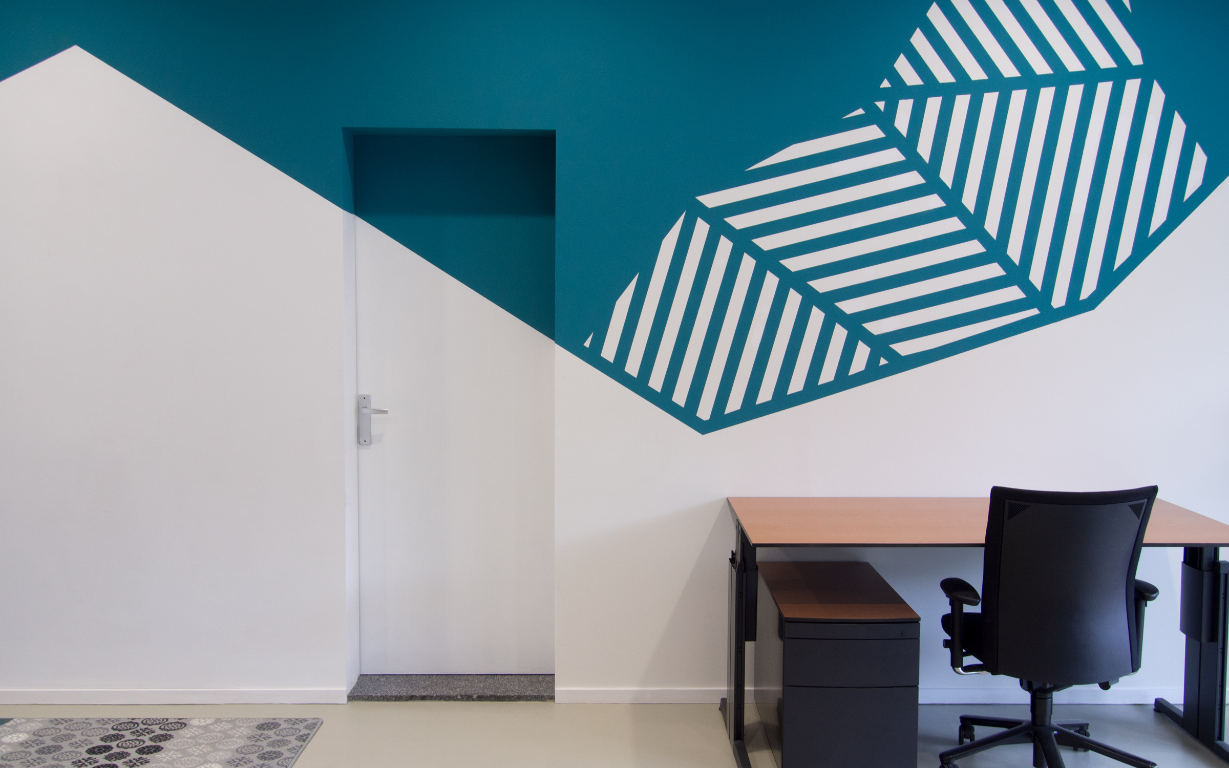
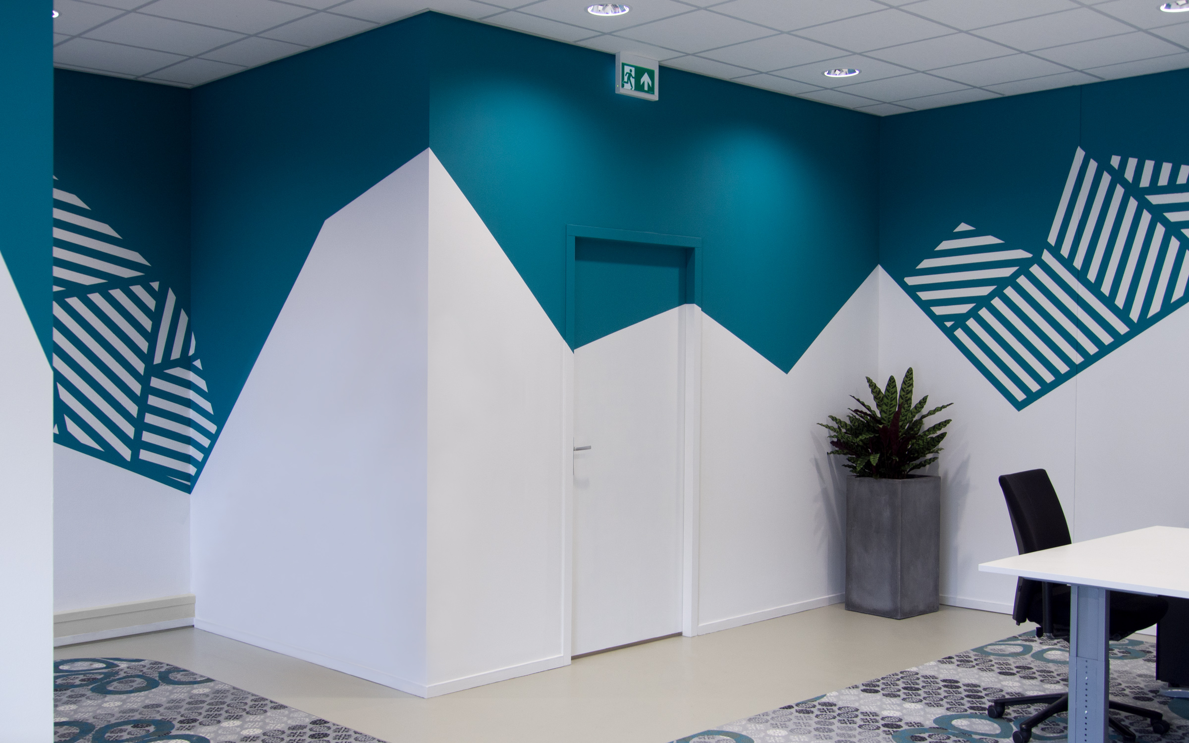
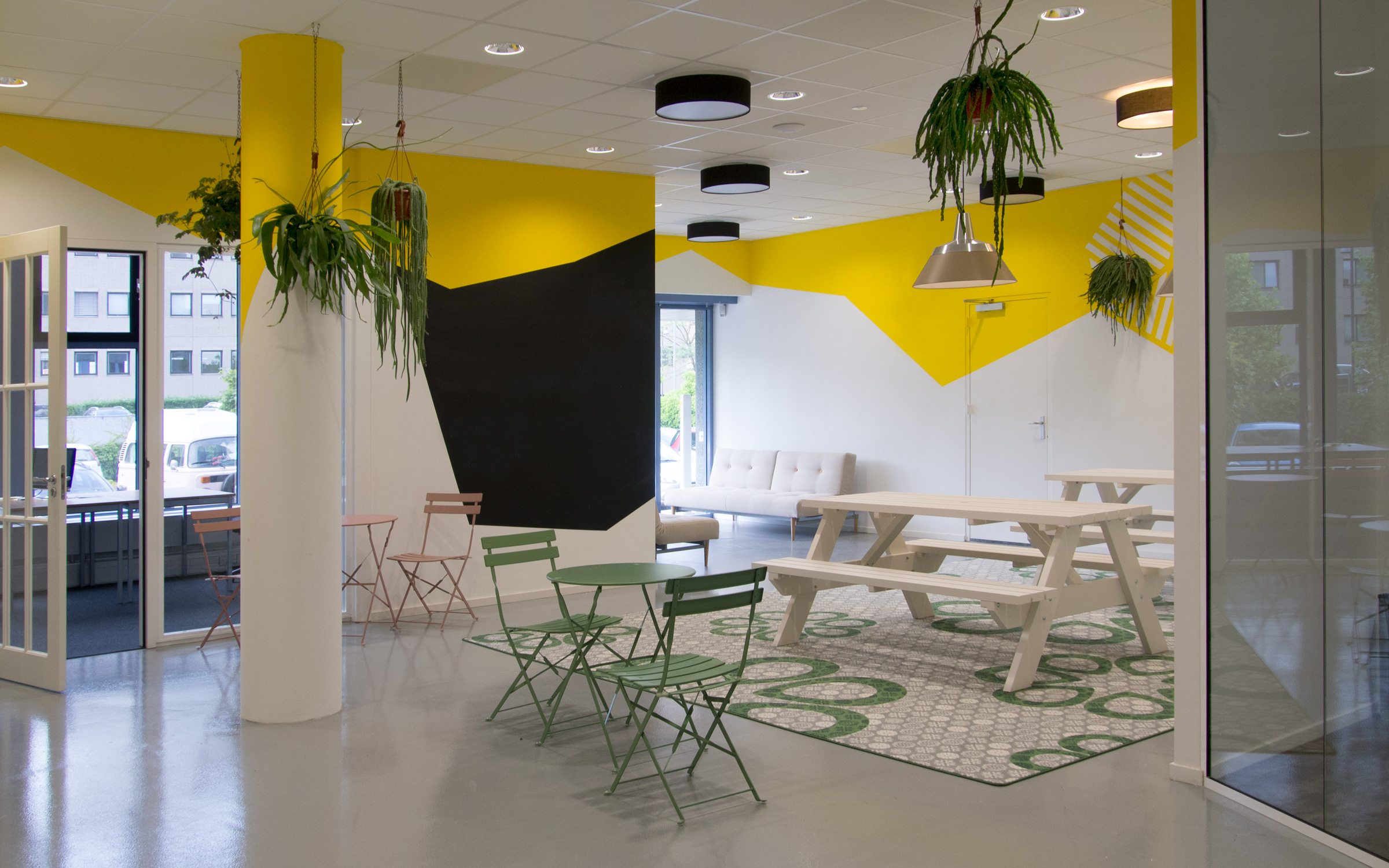
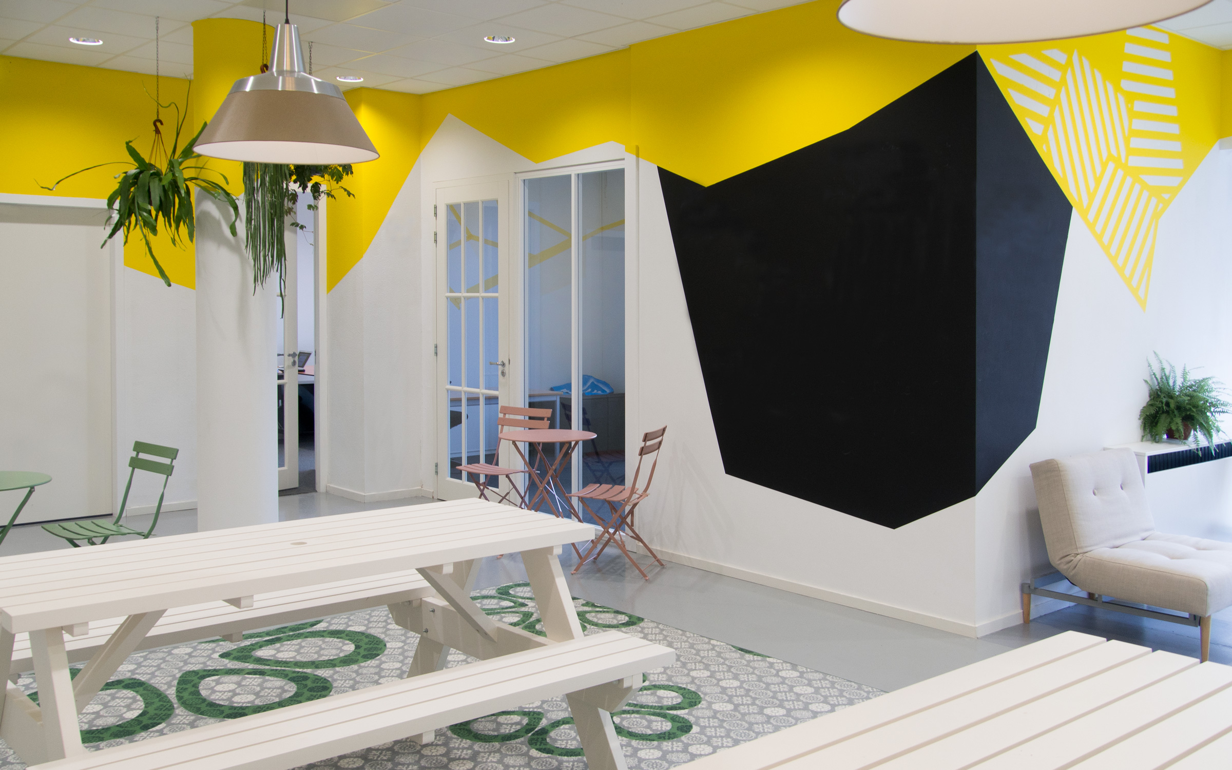
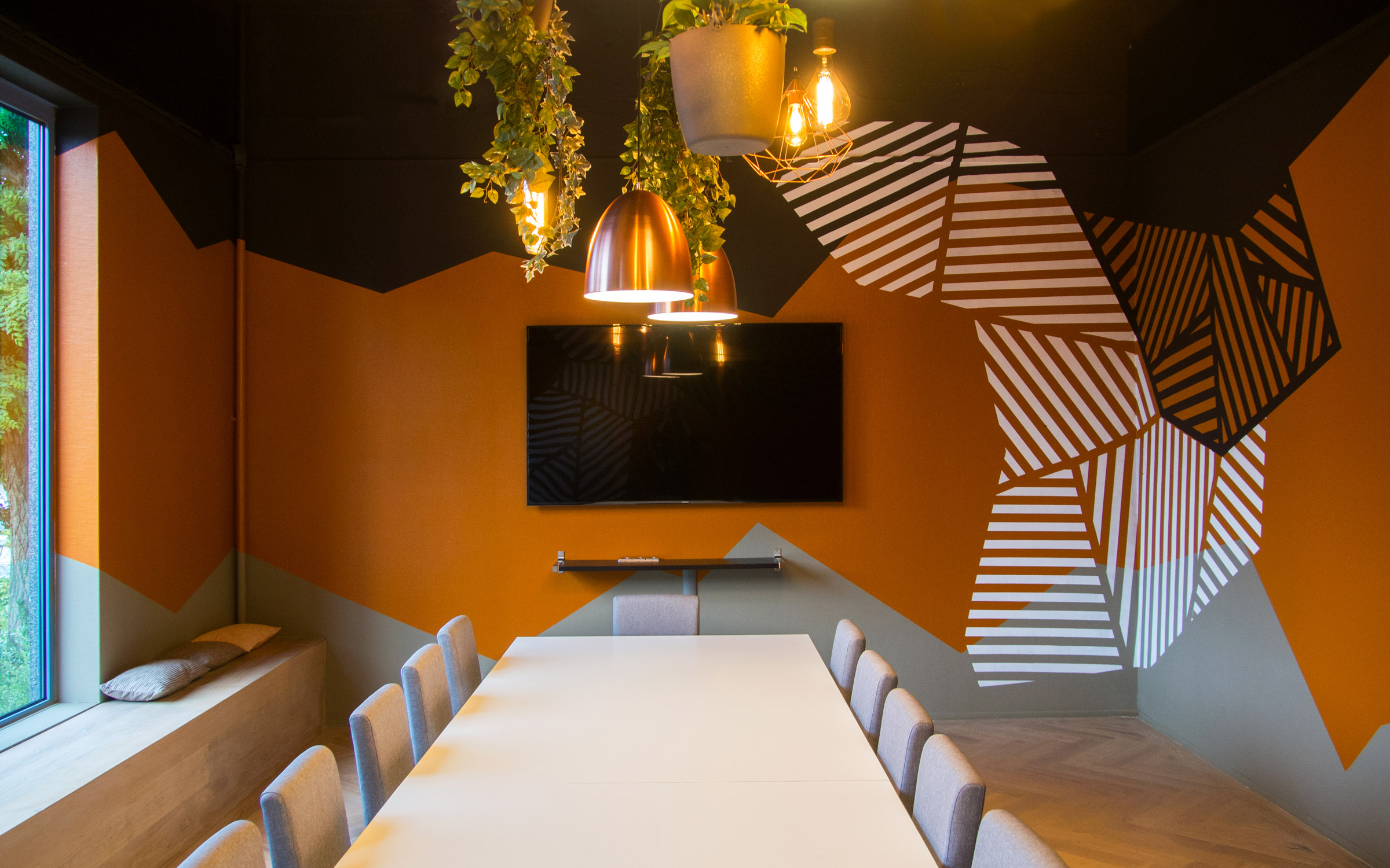
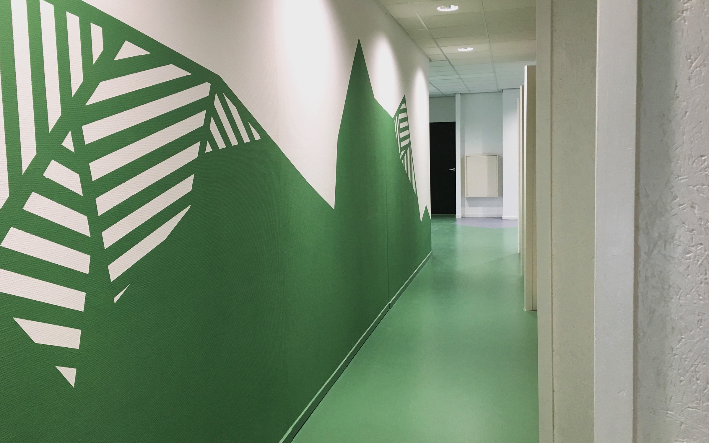
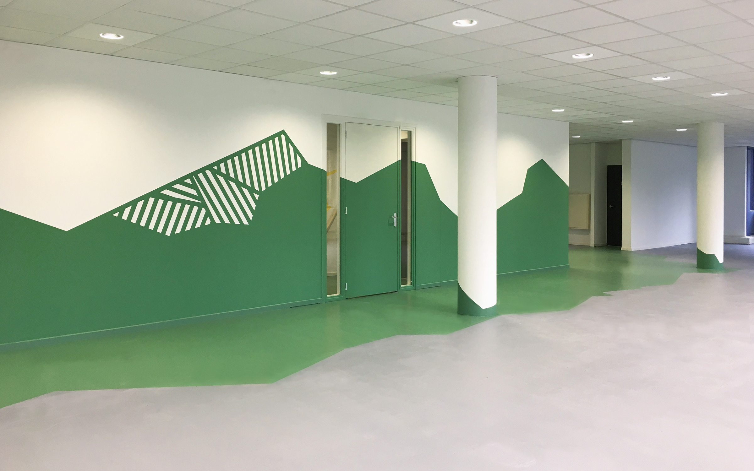
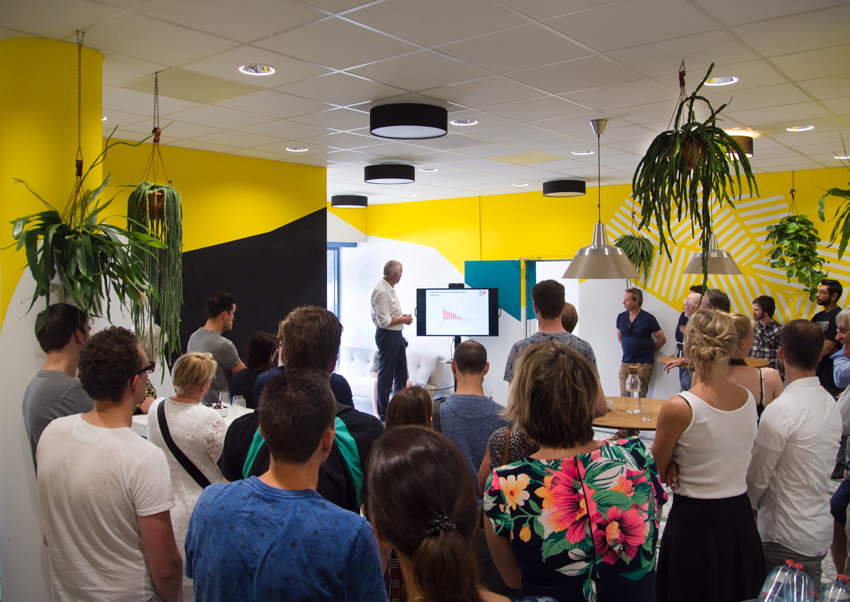
The focus of Stichting Graduate Space lies by startup companies. This foundation wanted a change and they asked Muurbloem to give them soem interior advice. Muurbloem gave them the advice to create more identity in the building. To create more identity, Muurbloem used the DISC method (dominant, interactive, stable, conscience). All competencies fit a color. Yellow stands for being interactive and creative. This color is applied by the lunch and the meeting spaces. Blue stands for conscience and this color is for the space of the flex workers. Red/brown stands for being dominant and thereby fits the boardroom. Green stands for being stable and social. Everyone can collaborate on the first floor, because there is an open adea that everyone can use. There is a green island in this area. All of the artwork contain a simulair dessin, so there is an unity.
Proceedings / Activities
Because of the equal deissins there appears more identity of Stichting Graduate Space. In various spaces we added different elements to create even more identity (elements like bags for plants or carpets). For example, the carpets matches the colors of the artwork in a room. Muurbloem also composed the furniture and made a lightning plan and color plan. The colors: yellow, blue and green, complemented by grey.
Method
The projectteam of Muurbloem shaped the concept of the interior with their client. Their employees shaped the concept with more details. They made a moodboard and this has been used as inspiration. The proces of this assigment has been managed by Muurbloem. Kwality and kwanity are outmost the indicators to achieve the best result.